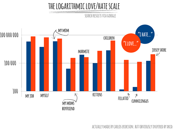
What started as a moment of boredom turns into a miniature journey into the relationship between Love and Hate as seen through the eyes — search results — of Google. Also, there’s charts and numbers because everybody loves charts and numbers, right?
It all really started with a day like any other, I was bored and had a random moment of curiosity and thanks to the wonders of modern technology I can quench my hunger for knowledge instantly. Also I get to write a post including the word “quench”. Because how often does that happen? And where — I suppose — most people simply settle their curiosity and move on with their lives… I… well, open up Excel and start making a chart mapping out the various search results I get. But surely that’s not strange? Maybe I could do a survey and map the results to a chart?
Now, that we’ve established that I “like” charts and statistics let’s move on to some of the data that didn’t make it into the chart for various reasons. Whilst I also “researched” people’s strong emotions towards things like; Christmas, War, Poverty and Terrorism none of these made it into the final chart. Partly because it was already getting crowded and partly because I didn’t feel like they added much to the data/joke.
A curios result though is that — again based on Google search results so you know, grain of salt and all that — people love War more than they hate it. The numbers came up 2,920,000 Hate vs. 6,250,000 Love. Weird, right? Then of course there’s the case of Marmite with its “Love it or hate it” slogan. Turns out, that that could be equally true of just about anything. Children, “Love them or hate them!”. Expect for oral sex, which for some — obvious maybe? — reason is clearly biased towards “Love”. Even when assuming an equal distribution of the giving/receiving ratio. In the end though, Marmite is — statistically speaking — more hated than it’s loved with 776,000 Hate to 430,000 Love. In your face, you repulsive Marmite! Now, Raisins is a different story, with its 185,000 Hate to 208,000 Love it’s the closest of all my results and I challenge you to find something more equal in terms of the distribution of Hate/Love.
You might also enjoy knowing that these numbers were based on a strict search query. E.g. “I love war” and “I hate war”, excluding results without the whole sentence. Or at least assuming that Google does that. The inspiration for most of the queries themselves are in turn based on Google results as well, thanks to their Auto-Suggest feature which paints an somewhat odd picture of what people feel strongly about.

Nothing really out of the ordinary here… Wait? Bear? Wtf? By the way… blame the movie “I love you Phillip Morris” for making it unreliable to just type in “I love”.

Ah, that’s more like it. Nothing strange here. As you can see I took more inspiration from the suggested hates. But in my defence, when searching for “I hate my bear” I was presented with a nice and neat result of 9. Which is why I took artistic freedom with which results to display.
Much later in the process of making this chart I realised that I would have enjoyed seeing a comparison between strong emotions and no emotions, in what I would have called “The Emotional Spectrum According to Google”. So yeah, now I am going to have to make such a chart too. Because, although it’s very interesting to see the difference between Love and Hate, it would be even more interesting to see how all of this compares to the phrase “I don’t care about…”1
But until I actually make that chart I think the time has now finally come to unveil the chart I did create. Obviously very inspired by the wonderfully enlightening xkcd.com but in my style.

-
The phrase “I feel indifferent towards…” didn’t yield many results. ↩