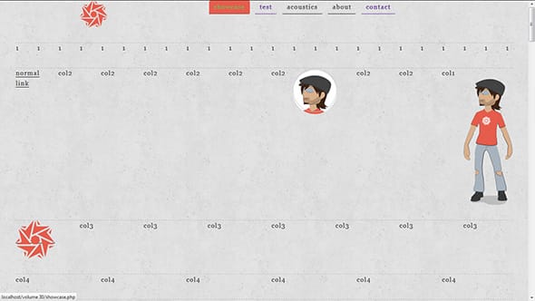
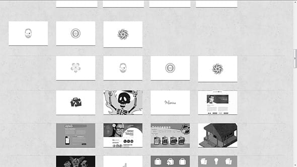
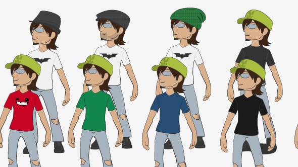
Holy crap. I honestly forgot that I was supposed to write a post today. Yeah, despite having done it now — to my own surprise — every day I still managed to forget it. Well… almost at least. So to make up for “almost forgetting” to write, I thought I’d ramble a little and then show you some screen shots of how the brand readjustment (from Fiinix Design to Carlos Eriksson) is going.
Tomorrow is Friday. I like Fridays. But then again, who doesn’t? So I suppose there isn’t much to say about Fridays.
I could talk about, that after much procrastination — but I didn’t procrastinate — I am finally making headway — but I’m not — with my site readjustments. Sure, some progress has been made since beije posted pictures of his readjustment progress — I didn’t even know he was doing one — and I got all super self-conscious about how I had made very little progress. Because apparently whilst beije had been building like a madman — that’s his usual style — I had calmly been sitting and playing around with .svg, intrinsic ratios and building a responsive/fluid 24-grid column system (I don’t like any of the ones that are out there). So it was decided that I would also post some screen shots of the progress I have made so far but let’s be fair, mine is not much of a looker. In fact, as it stands right now, it’s looking really fugly.
But that’s okay.
If there’s one thing I have enormous respect for it’s people having the balls courage to display their mistakes, not particularly to flaunt them — obviously — but rather to show the process behind something and how that process doesn’t always work out. Everyone knows that you don’t become Masterful at anything without failing a lot first. Yet there seems to be this enormous fear of showing ones failures. Mind you, not with everyone of course, but with enough people for it to bother me.
So here we go then. Here’s my mid-semi-failed work-in-progress. Bear in mind that everything you see here is currently being worked on and is very likely to change in a not so distant future. Exceptions to this rule: Logo and Avatar in first picture. Some things here are definitely going to end up in the released version, some things are not and some things I don’t actually know yet simply because I haven’t gotten around to discovering them yet. Copy and Art Direction are quite established though and that makes me super-mega-happy. Well… that, and that it’s Friday tomorrow.


