“Rebuilding a Brand” is such a boring fucking title, which is why I went with “The Bird In The Hand Is Dead” instead. Also because I like being cryptic in my titles in some sort of vain attempt to capture the attention of my audience — that’s you — and then give it all away by explaining the purpose — changing my brand from Fiinix Design to Carlos Eriksson and giving you a sneak preview of it — of the post before the jump.
As I mentioned previously in “I Suppose I Should Feel Bad”(link removed) I have been thinking about refining my website. Don’t bother going there yet, I haven’t refined it yet. I’m still fiddling about with a prototype because even though the current website is responsive I want to take it even further and design something that is more “device agnostic”. Which means rebuilding the entire structure… again… but that’s okay as I don’t actually mind that. I quite enjoy the empty canvas and the possibilities it presents.
Well… at least — much thanks to beije — I got the blog merger problem solved quite quickly. Not only did he write a parser for my needs, he created a repo for it at github so that anyone else could use it as well. At least I got to return the favour when he wanted me to design a logo for him.
Anyway.
I’m also supposed to be rebuilding our NHL Stats website into weplaynhl.com which means I haven’t been able to fully get into what will soon no-longer be called Fiinix Design. Yes, sad news indeed. I’m ditching the Fiinix Design moniker in favour of Carlos Eriksson. Why? Well, aside for the need to always explain how to spell it to people it’s also not very original. Whilst the Fiinix spelling might be more unique, the idea of the mythological bird is used by so many design-related companies that it borders on being a design cliché in itself. And if it’s something I’d rather not be associated with it’s being a cliché. So, the bird has to go. I for one, am looking forward to this natural evolution but I am very curious what you all think? Better? Worse? The same? You really couldn’t care less? Or perhaps you could in fact care less because despite your best effort of seeming suave and disinterested you are in fact a little bit interested. As I often ask you to wait with bated breaths I feel that now the turn has come for me to reciprocate the gesture. So, I will wait.
But… whilst I wait, I thought you might like a sneak preview of;
My new logo + the Fiinix Design Pink that is now… well… less pink and more tomato.
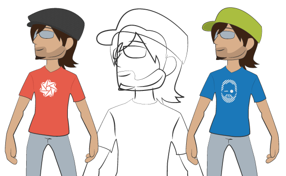
The avatar used to represent me. Still inspired by my previous avatar but now much more changeable (just like me) meaning the avatar itself will wear different outifts for different occasions. Illustrated here with one wearing a Carlos Eriksson branded t-shirt (left) and one wearing a beije branded t-shirt (right). Both are also wearing different hats because I like wearing different kinds of head wear and this is something I wanted to shine through in my brand as well. So far there are 20 different base items that can be combined…
…I just realised that I have to make a Movember variant as well…
